You spent time designing a popup. You set the trigger, picked a template, and hit publish. But visitors are still closing it without clicking anything. The design isn't the problem. The headline probably isn't either. Most of the time, the culprit is a popup CTA button that doesn't give people a good enough reason to act.
⚡ Quick Answer
What makes a popup CTA button high-converting?
A high-converting popup CTA button combines
action-first copy
(e.g. "Get My Free Guide" not "Submit"), a
contrasting button color
that stands out from the background, and a short
trust line
below (e.g. "No credit card required"). The copy should lead
with the benefit the visitor gets, not the action you want them to take.
This guide breaks down exactly what separates a forgettable popup button from one people actually click. You'll get real examples, a simple writing framework, and a mistakes list you can check against any popup you've already built.
What Is a Popup CTA Button and Why Does It Decide Your Conversion Rate?
A popup CTA button is the clickable element inside your popup that tells a visitor what to do next, "Get the Discount", "Start My Free Trial", "Download the Guide". It's the final ask after your headline and offer have done their job.
Here's the thing most people get wrong: they treat the button as an afterthought. They write the headline, design the layout, and then type "Submit" in the button field and move on. But the button is the conversion trigger. Everything else in the popup builds up to that one click.
202%
More conversions with personalized CTA copy (HubSpot)
28%
Higher conversion lift from A/B testing CTA wording
450%
More sign-ups after adding "No credit card required" under CTA
Those numbers come from changing a few words, not redesigning the whole popup. That's how much the button matters.
What Makes a Popup CTA Button High-Converting? (5 Core Elements)
There are five things every high-converting popup call to action has in common. Get all five right and you'll see the difference in your click-through rate within days.
1. Action-Oriented Button Copy
The words on your button should describe what the visitor gets, not what they have to do. "Submit" tells them nothing. "Get My Free Template" tells them exactly what's waiting on the other side of the click.
Use first-person phrasing whenever possible. "Start My Free Trial" consistently outperforms "Start Free Trial" because it feels personal — like the button was written specifically for the person reading it. Same words, slightly different arrangement, measurable difference in results.
Simple rule: If you can replace your button text with "Submit" and it still makes sense, rewrite it. Your CTA copy should be specific enough that "Submit" would be wrong.
2. High-Contrast Button Color
Your button needs to be impossible to miss. The WCAG 2.1 accessibility guidelines recommend a 4.5:1 contrast ratio between the button and its background, and it's not just about accessibility, it's about visibility. A button that blends in doesn't get clicked.
For most popups, orange, red, or a bright brand color works well. The specific color matters less than the contrast. If your popup background is white, a light yellow button will disappear. A deep teal or bold red won't.
3. Correct Size and Placement
Apple's Human Interface Guidelines and Google's Material Design both set a minimum tap target of 44×44 pixels for mobile. That's a baseline, not a goal. Wider buttons, especially on mobile, tend to perform better because they're easier to tap and harder to miss. Put the button after your value statement, not before it. Give the headline and subtext a chance to do their job first.
4. Urgency or Scarcity in the Copy
A button that says "Claim Offer, Ends at Midnight" performs differently than one that says "Get Offer". The first creates a reason to act now. The second creates no urgency at all. You don't need a countdown timer (though that helps), sometimes just the words "Today Only" or "Limited Spots" in or near the button are enough to shift behaviour.
5. Microtext Below the Button
Microtext is the small line of copy sitting just below your button, "No credit card required", "Cancel anytime", "Join 4,000+ subscribers". Most people skip this, and it's a mistake. That one line removes the last bit of friction before someone clicks. When a software company added "No credit card required" under their trial CTA, sign-ups went up 450%. It cost them nothing to write it.
| Element |
❌ Weak Version |
✅ Strong Version |
Why It Works |
| Button Copy |
Submit |
Get My Free Template |
Benefit-first, first-person language |
| Urgency |
Get Offer |
Claim Now, Ends Tonight |
Creates a reason to act immediately |
| Microtext |
(none) |
No credit card required |
Removes the last friction point |
| Button Color |
Matches background |
High-contrast accent color |
Draws the eye automatically |
| Button Size |
Tiny, hard to tap |
44px+ height, full-width on mobile |
Thumb-friendly, reduces missed taps |
How to Write Popup CTA Button Text: Step-by-Step
Here's a framework you can use on any popup, any offer type. Four steps. Takes about two minutes once you know what you're doing.
1) Define your single goal
Is this popup trying to capture an email, get someone to start a trial, claim a discount, or download something? Pick one. Your button should reflect only that goal, not everything at once. If your goal is lead capture, your button is about getting something. If it's a discount, it's about claiming something.
2) Choose the right action verb
The verb sets the tone. Use words that feel like a gain, not a chore. Strong verbs: Get, Claim, Start, Unlock, Download, Try, Join, Save. Weak verbs: Submit, Click, Go, Send.
Good: "Unlock My Discount" · Bad: "Submit"
3) Add the specific benefit
Don't just say what to do, say what they get. "Get My Free Guide" beats "Download" because it tells the visitor what's waiting on the other side of the click. The more specific, the better. "Save 20% on My First Order" beats "Get Discount" every time.
Good: "Save 20% on My First Order" · Bad: "Get Discount"
4) Add one trust signal below the button
Write a single line that answers the visitor's last hesitation. If it's a sign-up, address privacy: "We never spam. Unsubscribe anytime." If it's a trial, address commitment: "No credit card. Cancel whenever." If it's a purchase offer, address risk: "Free returns. No questions asked."
Microtext: "No credit card required · Cancel anytime"
Popup CTA Button Examples (By Use Case)
Theory is useful. Real examples are better. Here are four popup CTA examples across different use cases, each designed using the framework above. You can use any of these as a starting point in your own popups.
E-Commerce — Discount Popup
Claim My 15% Off →
Free shipping on orders over ₹999. No code needed.
Why it works: "Claim My" is first-person and action-driven. The specific discount (15%) is more compelling than "Get Discount". The microtext removes a common friction point — nobody wants to hunt for a promo code. Use this on your
e-commerce popups.
SaaS — Free Trial Popup
Start My Free Trial →
No credit card required. Cancel anytime.
Why it works: "Start My" ownership language makes it feel personal. The microtext handles both major objections in one line — payment and commitment. This is the CTA pattern that drove that 450% sign-up increase mentioned earlier. Works especially well for
SaaS popup campaigns.
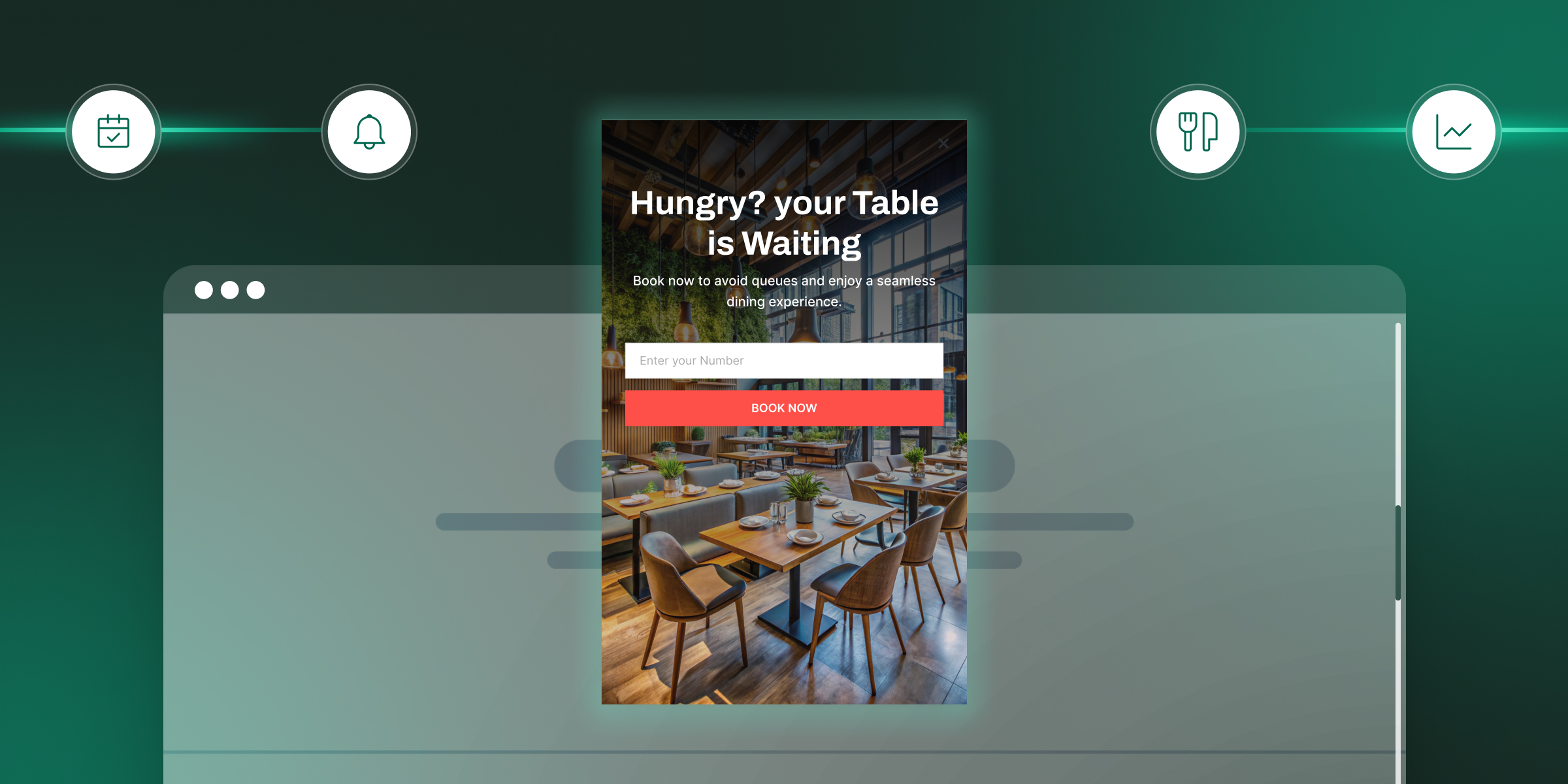
Lead Gen — Newsletter Popup
Get My Free Marketing Guide →
Joins 4,200+ marketers. Unsubscribe whenever.
Why it works: Specific offer ("Marketing Guide" not "Newsletter"). Social proof in the microtext ("4,200+ marketers") builds trust before the click. The word "Free" in a button consistently improves click rates for content giveaways.
Exit Intent Popup
Wait — Get 10% Off Before You Go →
One-time offer. Applied automatically at checkout.
Why it works: "Wait —" stops the scroll mentally. It acknowledges the exit intent without being desperate. The microtext removes effort ("Applied automatically") which is often the reason people don't bother claiming discounts. This is a classic
exit intent popup CTA
that converts leaving visitors.
Common Popup CTA Button Mistakes to Avoid
Most popup conversion problems come down to one of these five mistakes. Check your existing popups against this list before you build a new one.
| Mistake |
Why It Fails |
The Fix |
| Using "Submit" or "Click Here" |
No value signal. Tells the visitor nothing about what they get. |
Replace with a benefit-led verb: "Get My Free Trial" |
| Button blends with the background |
Invisible CTA = zero clicks. If visitors have to look for the button, they won't. |
Use a color that contrasts sharply with your popup background (min 4.5:1 ratio) |
| Two competing CTAs on one popup |
Choice paralysis. When people can't decide, they don't click either button. |
One primary CTA + a plain text "No thanks" dismiss link is enough |
| No microtext under the button |
Unresolved doubts about privacy, cost, or commitment kill conversions. |
Add one line: "No credit card" or "Unsubscribe anytime" |
| Button too small on mobile |
Below 44px height, taps become misses. Frustrating UX = immediate close. |
Set minimum 44×44px, make it full-width on mobile screens |
How to A/B Test Your Popup CTA Button (and What to Test First)
You can follow every best practice here and still miss something that's specific to your audience. That's why A/B testing your popup button copy and design is worth the effort. Companies that run four or more CTA tests per quarter see an average 34% improvement in conversion, and those running multivariate tests (button color + copy + placement together) see up to 47%.
The key is testing one variable at a time so you know what actually moved the needle. Here's what to test, in order of impact:
- Button copy first: Highest impact, easiest to change. Test first-person vs. second-person ("Get My Guide" vs. "Get Your Guide"). Test specific vs. vague ("Claim 20% Off" vs. "Get Offer").
- Button color second: Test your current color against a high-contrast alternative. Keep everything else identical.
- Microtext variations: Test "No credit card required" vs. "Free forever" vs. nothing at all. The results often surprise you.
- Button size on mobile: Test full-width vs. centered fixed-width. Full-width usually wins on small screens.
Worth knowing: Don't end a test early just because one version looks like it's winning. Wait until you reach statistical significance, or you'll make decisions based on noise, not data.
FAQ’s
1) What should a popup CTA button say?
Your button should combine an action verb with a clear benefit, for example, "Get My Free Guide" or "Claim 15% Off Now". Avoid generic labels like "Submit" or "Click Here". Add a short trust line below the button (like "No credit card required") to handle the last objection before someone clicks.
2) What is the best color for a popup CTA button?
There's no single "best" color, the right choice is the one that contrasts most sharply with your popup background. Red, orange, and green are common high-performers, but what matters is a minimum contrast ratio of 4.5:1. Always test your color choice against your specific design before committing to it.
3) How big should a popup CTA button be?
The minimum recommended size is 44×44 pixels, both Apple and Google set this as their tap-target guideline for mobile usability. In practice, full-width buttons on mobile popups tend to perform better than centered fixed-width ones, simply because they're harder to miss.
4) How many CTA buttons should a popup have?
One primary CTA button. You can include a plain-text "No thanks" dismiss option, but avoid adding a second button that competes with the main action. When visitors face two equal choices, most end up choosing neither. Keep the decision simple: one clear action, one soft exit.
5) How do I make my popup CTA button more urgent?
Add time or quantity language directly in or near the button. "Claim Now, Ends Tonight", "Today Only", or "Only 5 Left" all create urgency without feeling gimmicky, as long as the scarcity is real. Pairing urgency copy with a visible countdown timer in the popup amplifies the effect significantly.
Try It Free — No Code Needed
Build Your First High-Converting Popup in 5 Minutes
SuperPopups gives you ready-made templates, smart targeting, and a visual editor that makes it easy to apply everything in this guide, without writing a single line of code.
No credit card required · Free plan available · Cancel anytime


.avif)






.jpg)




.jpg)


.jpg)



.jpg)

.jpg)
.jpg)


.jpg)